Friday, February 5, 2016

Tonal Layering

Today, we started trying to create our own lessons that we may want to teach to our future students. We looked through books provided to us by our professor that are tied to the different elements and principles of design.  In Creative Colored Pencil Workshop by Carlynne Hershberger and Kelli Money Huff, I found a great lesson on Tonal Layering using colored pencils (Prisma colored pencils are the best to use).

Tonal layering is the method of applying colored pencils in multiple light layers to build color.  You're basically creating a smooth area of color without visible pencil strokes.  There are four steps in creating this technique:
1. Draw, then apply the first layer.
2. Add more color and begin modeling.
3. Deepen the colors.
4. Add the dark values.
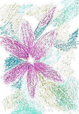
 Here is my example that I created for my students to see.  I didn't use Prisma colors, just regular colored pencils because that's what I had available at the time.  Depending on the school's budget, you could get Prisma colored pencils for all your students.  If not, they may have to use regular colored pencils, which is fine, because they'll still get the concept.

This would tie to the elements of value and texture, along with the principle of unity because the goal is to unify the piece adding layers of colors so that the pencil lines aren't showing.  

Before I do this lesson with my students, we would research on artists that include tonal layering in their work.  Artist like Robert Sloan and Linda MaCauley are good examples because they incorporate tonal layering with different mediums, such as oil pastels and watercolors.


Pink Clematis sketch in tonal layers in Niji oil pastel on paper.Second stage of Clematis tonal sketch, with layers of new colors added.
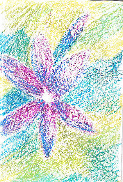
Above is a work of art by Robert Sloan.


Still Life Drawings

Today we will be talking about Still Life Drawing.  The first thing you need to know before starting is information about the drawing pencils.  Certain pencils draw certain shades.


Above are the different shades each different pencil makes.  "H" is considered the middle or the basic pencil.  It's best to use drawing pencils versus just a regular No. 2 pencil so you can get the correct shades that you want for whatever still life you're drawing and they're cool, so yeah!

First, we practiced creating value with some shading exercises like the ones above.


Now for the drawing!  We could either use a still life that our professor brought in, or bring our own (which i did).  We created three thumbnail sketches with different compositional arrangements on Newprint paper, then transferred one of the sketches to our real nice paper called Stonehenge.  We then turned the lights off and flashed a light over our still life to take a picture of the value differences, so that we would be able to add value to our drawing.  Once we drew the contour of it, we followed our pictures and added value to the drawing.  As you can see, I wasn't able to get too far with mine in the class session but here's how it looks so far.  I do plan on finishing it.


Here are some other examples from some high school students and some of my classmates.


The biggest problem for me is adding the value.  I'm more of a contour drawer, so the value part was where i struggled and I'm sure this will be a problem for a lot of students, whether it's them not knowing how to shade the drawing, or just being too lazy to do it.  What i have to do in order to be able to add value is start shading in sections from right to left.  With my students, i would just encourage them to do the same and also not to rush it.  Take their time with each section, if that means covering up the sections they aren't working on and go about it that way.